Ever notice how certain colors instantly make you feel at home?
That’s exactly what happens with vanilla latte color – this warm beige shade does something special that most neutrals can’t. Unlike stark whites or cold grays, it wraps your space in gentle warmth.
I’ve seen how this versatile hue changes both sleek modern homes and cozy traditional spaces. It creates that perfect backdrop where you actually want to linger, not just pass through.
Let me show you why this comforting shade might just be the missing piece your home needs.
Jotun Vanilla Latte on the Color Wheel
When I look at vanilla latte on the color wheel, it sits perfectly between warm off-whites and light tan tones. It’s not quite cream, but definitely warmer than basic beige.
Lighting changes everything with this shade. In natural daylight, I notice it shows cooler undertones. But under warm artificial light? It becomes incredibly cozy and inviting.
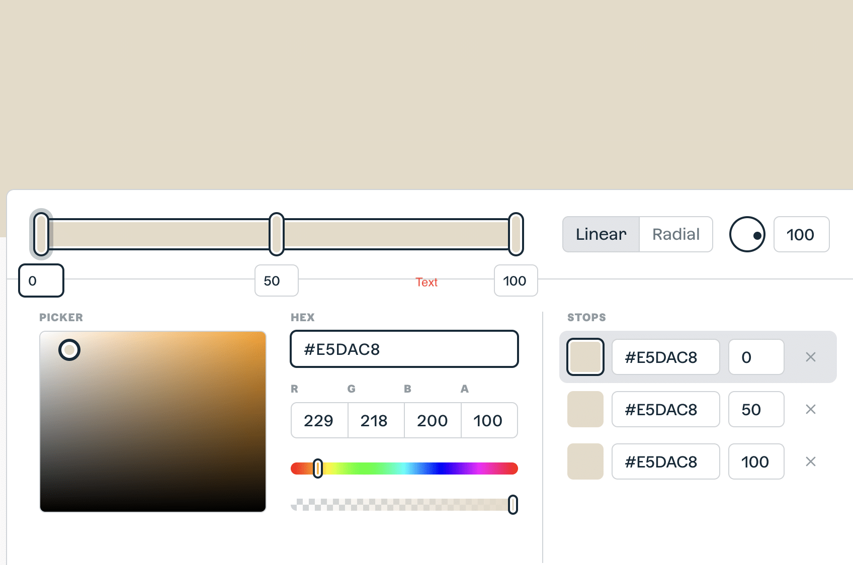
Here’s what makes this color special in proven technical terms:
| Color Property | Vanilla Latte Details |
|---|---|
| LRV | 70.89% (reflects most light) |
| HEX Code | #E5DAC8 |
| RGB Values | 229, 218, 200 |
| Undertones | Beige, creamy taupe, warm neutral |
This technical info helps, but what I really love is how forgiving this color is in different rooms and lighting conditions.
Best Combinations with Vanilla Latte
Creating beautiful color combinations with vanilla latte color is easier than you think.
I’ve found this warm neutral works perfectly whether you want soft monochromatic schemes or bold complementary contrasts.
Similar Color Options for Vanilla Latte Color
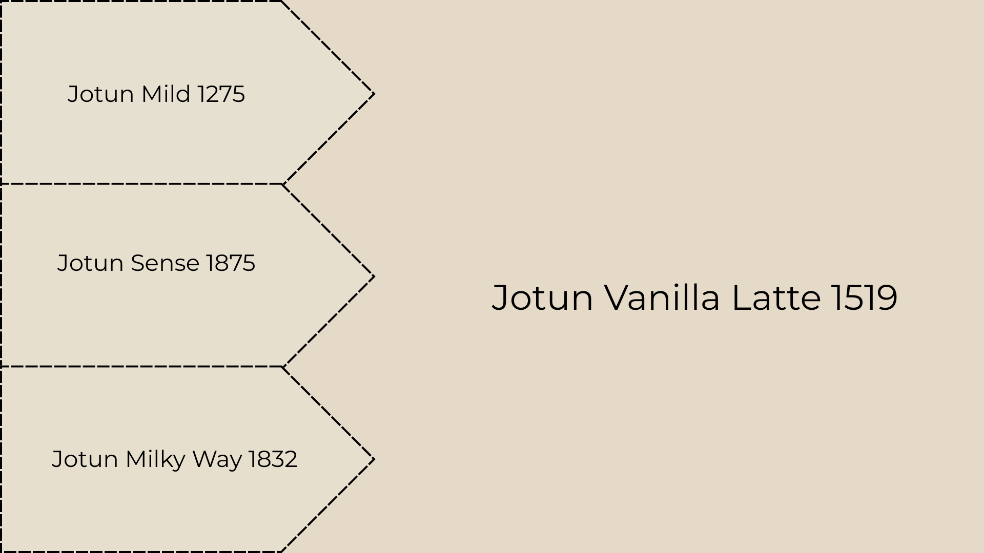
I love working with monochromatic hues because they create such peaceful, cohesive spaces. With vanilla latte as my first choice, I have some similar shades to offer to people looking for slightly different undertones.
This soft off-white has an LRV of 74.4%, meaning it reflects tons of light and makes rooms feel bigger. I painted a client’s small hallway in Mild, and it completely opened up the space. It’s like Vanilla Latte’s lighter, airier cousin.
Another high-reflecting neutral with an LRV of 73.79% that’s perfect for ceilings. One client had dark wood beams, so I used Sense on the ceiling to balance the heaviness. It’s whisper-quiet but still has character.
The creamiest of the light tones with an LRV of 73.93% and just a hint of warmth. I love using this in nurseries or spaces where you want that soft, cloud-like feeling.
Layering Subtle Monochromatic Neutrals
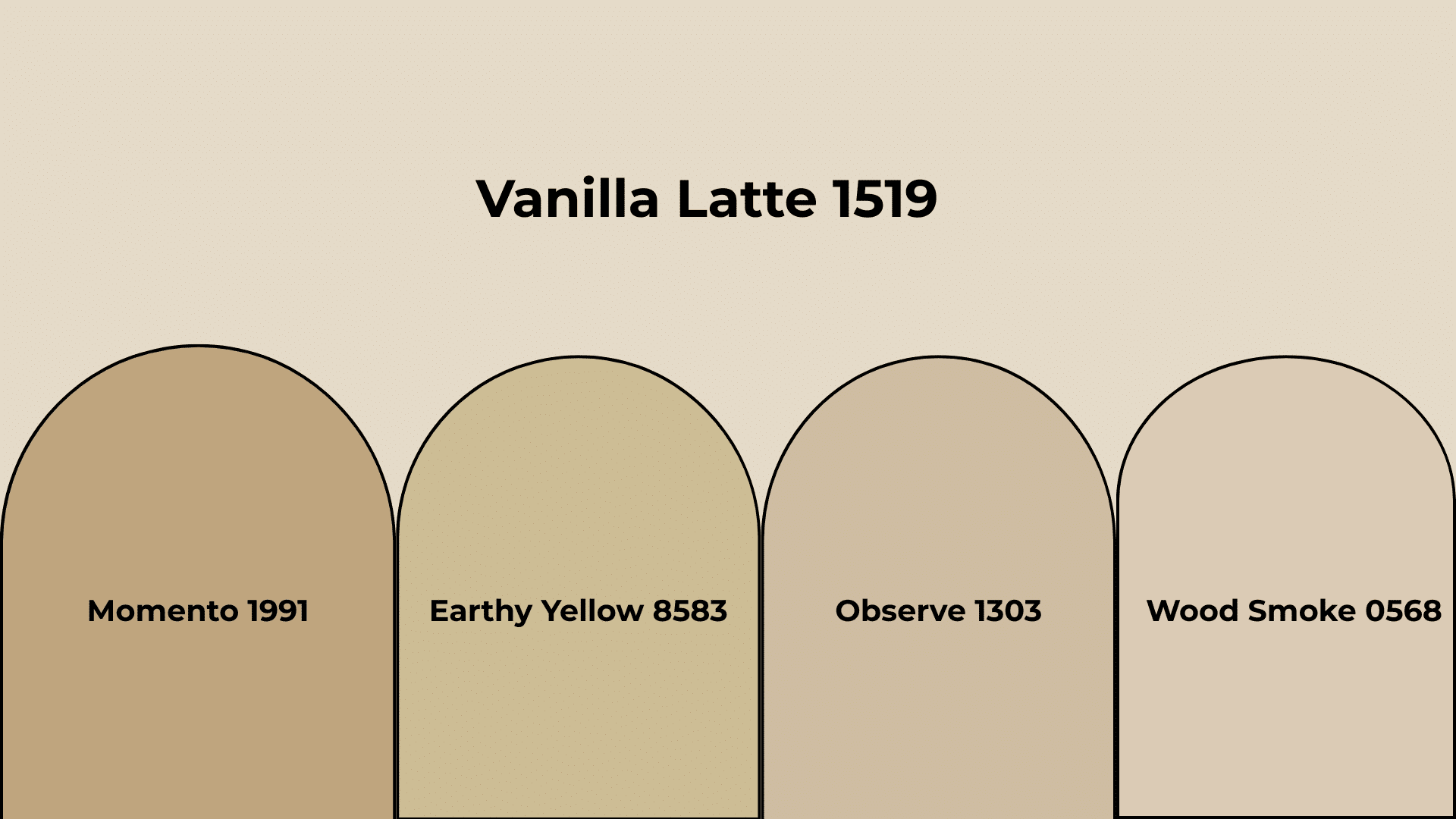
These richer tones add urbanity and depth to any vanilla latte color scheme. I reach for them when clients want more drama or need to ground a space with stronger anchor points.
This rich taupe has an LRV of 39.2%, adding serious depth without being dark. I used it on one accent wall in a client’s dining room, and it made their art collection pop beautifully.
Warm and grounding with an LRV of 50.6% and subtle yellow hints. Perfect for a cozy reading corner I designed last month. It feels like sunshine filtered through linen curtains.
A sophisticated mushroom tone with an LRV of 52.08% that works anywhere. I painted kitchen cabinets in this color for a client who wanted something unique but timeless.
The perfect medium neutral with an LRV of 60.75%, this color bridges light and dark tones. I use this constantly for built-ins and trim work.
Creating Calm with Complementary Hues
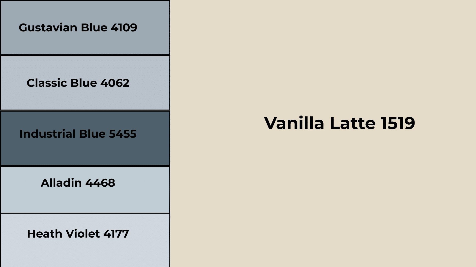
This muted blue-gray has an LRV of 38.48% and creates the most calming contrast with vanilla latte. I paired these in a client’s bedroom, and they said it felt like sleeping in a cloud. The combination is sophisticated but never cold.
Lighter and softer than Gustavian, this blue has an LRV of 51.93% and feels like morning mist. One client wanted a coastal vibe without the cliché, so I used this with Vanilla Latte throughout their living room.
The darkest option with an LRV of 11.02% that adds serious drama. I used this on kitchen cabinets while keeping the walls in Vanilla Latte. The contrast was striking, but still felt homey.
This pale blue-gray has an LRV of 59.12% and is like wearing your favorite soft sweater. Perfect for bathrooms or any space where you want tranquility with warmth.
The lightest option with an LRV of 66.91% and subtle violet undertones. I painted a powder room in this color with Vanilla Latte trim, and guests always comment on how serene it feels.
Vanilla Latte Color Palette Inspiration
I’ve found that vanilla latte color adapts beautifully to different design styles. Here’s how I use it across various lifestyle palettes:
Soft Romantic
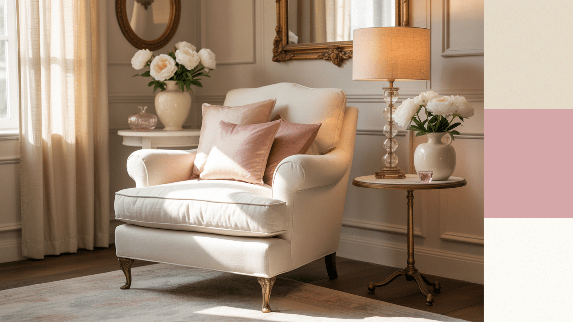
This is where vanilla latte truly shines. I pair it with dusty pinks and cream whites to create spaces that feel like a gentle hug.
Accents: Blush pink throw pillows, antique brass hardware, cream ceramic vases, soft gray textiles
Decor Items: Vintage mirrors with ornate frames, fresh white peonies, linen curtains with subtle texture, crystal table lamps with fabric shades
Modern Boho Earth
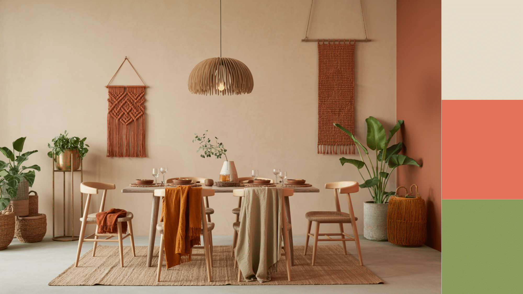
Here, I combine vanilla latte with terracotta and sage green. The result feels grounded yet free-spirited.
Accents: Rust-colored macrame wall hangings, natural jute rugs, brass plant stands, woven baskets in caramel tones
Decor Items: Large leafy plants in ceramic planters, wooden coffee tables with live edges, textured throw blankets, pendant lights with natural fiber shades
Classic Minimalist
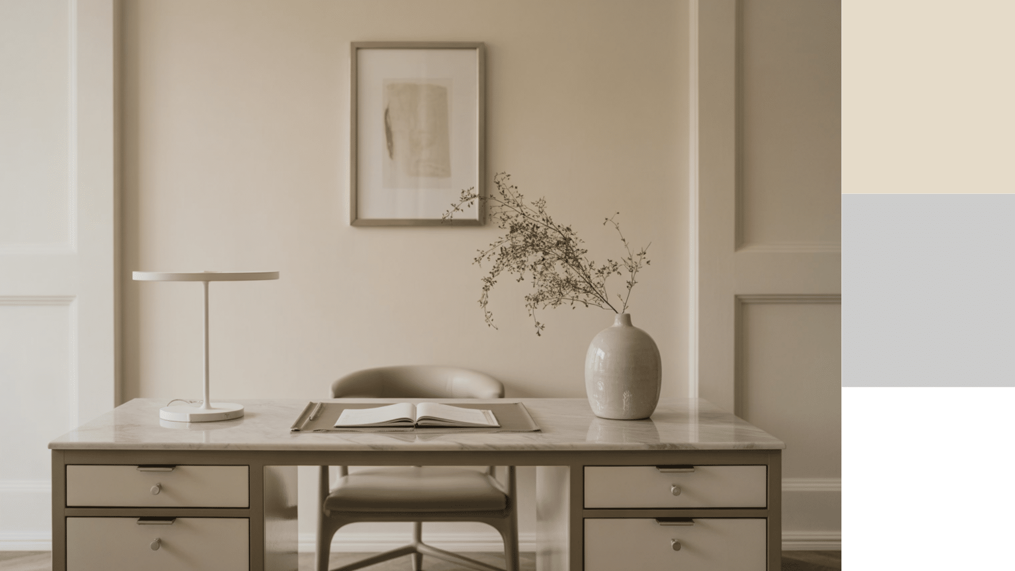
I love pairing vanilla latte with crisp whites and soft grays for this clean, uncluttered look. It adds warmth without chaos.
Accents: White marble countertops, brushed steel fixtures, pale gray ceramics, linen bedding in natural tones
Decor Items: Single statement art pieces, sleek table lamps, glass vases with simple lines, neutral throw pillows with geometric patterns
Nordic Scandi Blend
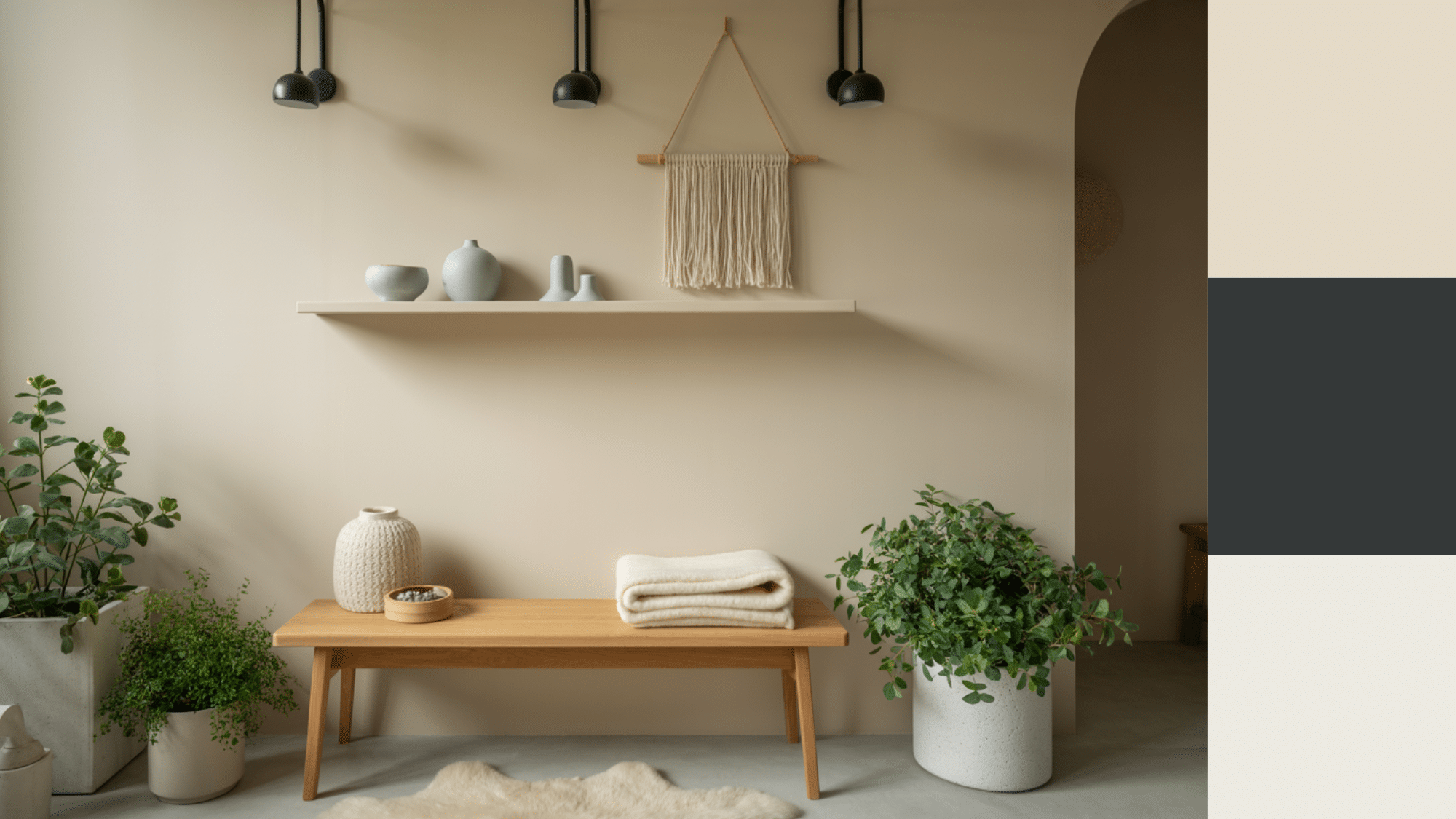
This is my go-to for clients who want cozy but clean. I mix vanilla latte with cool whites, pale woods, and touches of charcoal.
Accents: Light oak furniture, white wool throws, black metal light fixtures, pale blue ceramic pieces
Decor Items: Sheepskin rugs, simple wooden candlesticks, white ceramic planters, woven wall art in natural fibers
Wrapping Up
After working with countless color schemes, I keep coming back to vanilla latte color for one simple reason, it just works.
This warm beige brings that perfect balance of sophistication and comfort that most neutrals miss.
Whether you paint one accent wall or transform your entire home, this palette creates spaces where life actually happens. It’s forgiving with mistakes, works with any lighting, and grows with your style over time.
Your home should welcome you. Vanilla latte color does exactly that.