Spring color analysis reveals fresh, warm undertones that make skin glow with vitality.
Many people struggle to translate their spring palette into real outfits that feel both flattering and original to their personal style.
The right styling approach can help spring types build wardrobes that truly complement their natural coloring while expressing their unique personality.
This blog offers comprehensive details about the Spring Color Analysis palette.
Color Analysis: Spring and Its Palette
Color Analysis Spring refers to people with warm, bright undertones in their skin, hair, and eyes.
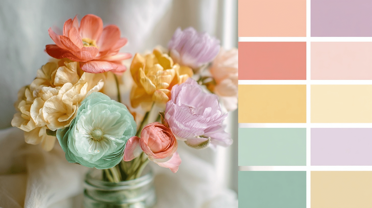
Springs look best in warm, vibrant colors, such as coral, golden yellow, warm greens, and clear blues. These colors make their skin appear healthy and radiant.
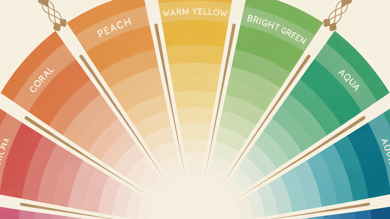
The spring color palette is further divided into 4 distinct parts:
- Bright Spring – Clear, vivid colors with high contrast
- Warm or True Spring – Rich, golden-toned colors with warmth
- Light Spring – Soft, delicate colors with gentle brightness
The True Spring Seasonal Colour Palette

True Spring represents the purest form of the spring color palette, featuring warm and vibrant colors that mirror nature’s awakening in the spring. This palette features colors with yellow undertones that create a fresh and energetic feel.
Core True Spring Colors:
- Warm Reds & Pinks: Coral red, tomato red, coral pink, salmon pink, warm rose, warm scarlet
- Bright Oranges & Yellows: Bright orange, peach, apricot, golden yellow, daffodil, butter yellow
- Fresh Greens: Kelly green, grass green, lime green
- Radiant Blues & Purples: Turquoise, aqua, periwinkle, violet, warm lavender
- Soft Neutrals: Warm beige, camel, golden brown, ivory
Colors to Avoid:
True Springs should steer clear of cool-toned colors, such as burgundy, navy blue, black, pure white, and icy pastels. These colors can make their skin appear dull or washed out.
The True Spring palette works because these warm, clear colors complement the golden undertones naturally present in spring types’ skin, creating harmony and making them look vibrant and healthy.
The Bright Spring Seasonal Colour Palette

Bright Spring represents the most vibrant and clear variation of the spring color palette, featuring intense, saturated colors with warm undertones.
This palette features bold and energetic colors, reminiscent of tropical flowers and summer sunsets, with maximum clarity and brightness.
Core Bright Spring Colors:
- Vibrant Reds & Pinks: True red, poppy red, hot pink, fuchsia, bright coral, watermelon
- Bold Oranges & Yellows: Electric orange, tangerine, bright peach, lemon yellow, golden yellow, sunny yellow
- Clear Greens: Bright green, emerald green, spring green, apple green
- Intense Blues & Purples: Royal blue, cobalt blue, bright turquoise, electric blue, magenta, bright purple
- Clear Neutrals: Pure white, light gray, warm gray, navy (warm-toned), chocolate brown
Colors to Avoid:
Bright Springs should avoid muted, dusty, or overly soft colors such as pale pastels, beige, taupe, and any colors with gray undertones.
These subdued shades will make their natural vibrancy appear dull.
The Bright Spring palette works because these clear, intense colors match the high contrast and clarity naturally present in the features of bright spring types, making them look radiant and full of life.
The Light Spring Seasonal Colour Palette
Light Spring represents the softest and most delicate variation of the spring color palette, featuring gentle, warm colors with light intensity.
This palette contains colors that are fresh and airy, like early morning light filtering through spring blossoms with subtle warmth and softness.
Core Light Spring Colors:
- Soft Reds & Pinks: Light coral, soft peach pink, warm rose, blush pink, light salmon, dusty rose
- Gentle Oranges & Yellows: Soft peach, light apricot, pale yellow, cream yellow, warm ivory, champagne
- Muted Greens: Soft mint, sage green, light olive, warm seafoam, pale lime
- Delicate Blues & Purples: Light turquoise, soft aqua, powder blue, lavender, warm periwinkle, lilac
- Light Neutrals: Cream, warm white, light beige, soft camel, warm gray, pearl
Colors to Avoid:
Light Springs should avoid dark, heavy, or overly saturated colors such as black, deep navy, burgundy, bright orange, and intense jewel tones.
These strong colors will overpower their delicate natural coloring.
The Light Spring palette works because these soft, warm colors complement the gentle contrast and light intensity naturally present in light spring types’ features, creating a harmonious and fresh appearance.
Wardrobe Recommendations for Spring Types
Color analysis spring types shine in light, warm, and clear colors that enhance their fresh and youthful look. Think buttery creams, corals, and gentle greens that mimic the brightness of spring.
Let’s talk about your wardrobe must-haves:
1. Lightweight Trench Coats
A neutral-toned, lightweight trench is a spring essential. For Spring types, opt for soft camel, ivory, or peach-beige. These keep the look fresh while adding polish to any outfit. Belted or open, it complements your natural coloring without overpowering.
2. Bright Knit Cardigans
Spring’s warmth pairs well with breathable knits. Choose lightweight cardigans in coral, aqua, or warm periwinkle. They add a pop of color while still feeling soft and approachable. Avoid harsh black or overly muted tones.
3. Floral Print Dresses
Spring types glow in delicate, warm florals. Choose dresses with blossoms in peach, soft pink, and leafy green. Opt for flowy silhouettes and midi or tea-length dresses. Look for florals on cream or light beige bases, not stark white.
4. Soft-Colored Denim
Trade in deep indigo for pastels or warm beige. Think blush, light coral, or warm sand denim that softens the look and harmonizes with Spring tones. Pair with white, mint, or peachy tops to stay within your color palette.
5. Warm-Toned Blouses
Spring types do best with blouses in warm whites, peach, coral, and light golden hues. Go for lightweight fabrics like chiffon or cotton with delicate details. Keep patterns subtle and cheerful.
6. Neutral & Nude Footwear
Instead of stark black, Spring types should embrace light tan, nude, or warm caramel shoes. These tones blend seamlessly with spring outfits and flatter warm undertones. Prioritize natural materials like leather or canvas for a soft finish.
7. Accessories in Gold & Peach Tones
Jewelry and accessories should echo the springtime vibe. Think light gold, rose gold, warm turquoise, or coral beads. Bags in cream or peachy pinks keep your palette harmonious and bright.
Final Thoughts
Spring color analysis opens doors to effortless style that truly works with your natural beauty.
When you choose colors that complement your warm undertones, getting dressed becomes simpler and more enjoyable. Your spring palette creates a cohesive wardrobe where pieces naturally complement each other.
Start small by adding one or two spring staples to your current wardrobe, then gradually build from there.
Ready to change your style? Begin with a cream blouse or coral accessory and notice how these colors make you feel.