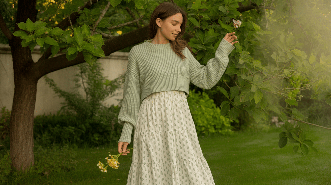
The fall and winter seasons can be really harsh, forcing you to pack all your pretty dresses. But can you style those dresses in cold temperatures? Then rest assured, as this blog post will provide all the helpful tips and ways on how to wear a sweater over a dress. You’ll also learn how to wear a sweater dress for
Most Popular
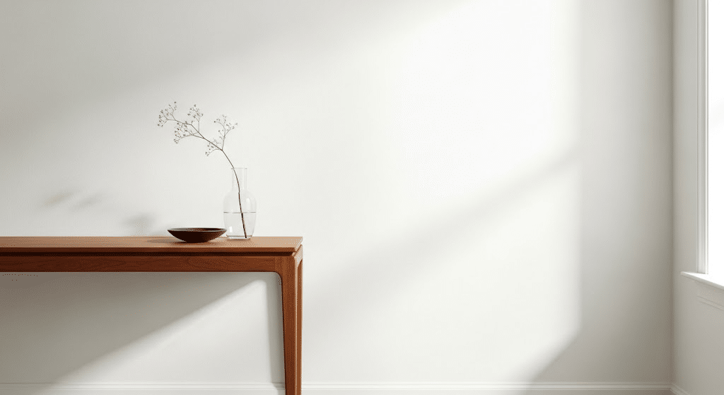
Have you ever walked into a room and felt instantly calm? That’s the magic of white paint done right. I’ve seen countless homeowners struggle to find the perfect white for their space, one that works on walls, cabinets, and even a waterfall island without looking flat or stark. I’ll show you exactly why Chantilly Lace Benjamin Moore has become a top choice for designers and homeowners alike. In this blog, I’ll cover its LRV and undertones, the best rooms to use it in, and which colors pair beautifully with this crisp white. Plus, when you might want to skip it altogether. What Makes OC-65 Chantilly Lace Benjamin Moore so Popular? I’ve watched Chantilly Lace climb to the top of every designer’s white paint list, and honestly, it’s not hard to see why. This crisp white has something special that most others lack: true neutrality. While other whites can look pink in morning light or blue in the evening, Chantilly Lace stays consistent. Profile Breakdown Attribute Description Undertone Virtually no visible undertones; subtle whisper of coolness Tone Description Crisp, clean, and modern, one of the truest whites in Benjamin Moore’s lineup Temperature Feel Slightly cool, but not cold or sterile LRV 92.2: highly reflective and bright Color Family Off-White Collection (OC-65), grouped with Cloud White and White Dove Before and After Makeover Using Chantilly Lace Benjamin Moore See how Chantilly Lace works its magic in real homes! These before-and-after makeovers highlight just how dramatically this crisp white can brighten, open up, and modernize any space. Living Room Before: A main living space with cream walls that looked tired and outdated. The room felt disconnected from the kitchen and lacked the bright, open feel the family wanted for daily life. After: Chantilly Lace walls in eggshell created a fresh backdrop that made the entire space feel larger and more cohesive. The white allowed colorful furniture and artwork to really stand out. Natural light bounced around beautifully, and the room now flows perfectly with the white kitchen cabinets. Family gatherings feel more welcoming and bright. Powder Room Before: A cramped half-bath with builder-grade beige walls that felt dingy and dark. The space looked smaller than it actually was, and guests always commented on how closed-in it felt. After: We painted everything – walls, ceiling, and trim in Chantilly Lace with semi-gloss finish. The room instantly doubled in visual size. The white reflected light from the small window, making the space feel bright and clean. Added black hardware and a dark vanity for contrast, and suddenly this forgotten space became a showstopper. Laundry Room Before: A dull utility space with yellow-tinted walls that made doing laundry feel like a chore. Poor lighting made it hard to spot stains or sort colors properly. After: Chantilly Lace on the walls in satin finish turned this into a space I actually enjoy using. The white brightened everything up, making it easier to see what I’m doing. I paired it with white cabinets and added some colorful storage baskets. Now it feels like a proper room, not just a utility closet. Dining Area Before: A formal dining room with heavy, dark walls that made family meals feel stuffy and outdated. The space was rarely used because it felt so serious and unwelcoming. After: Chantilly Lace opened up the entire space and made it feel connected to the adjacent kitchen. The white walls let the dining table and chandelier become the stars. Now we use this room daily because it feels fresh and inviting. The natural light from nearby windows really shines now. Design Pairings Choosing the right colors and finishes can modify Chantilly Lace from simple to stunning. Here are my favorite pairings, accent ideas, and flooring tips to help you create a cohesive, inviting space. Coordinating Colors Pairing Description Warm Woods Chantilly Lace keeps honey oak or walnut from feeling heavy, while wood adds warmth to avoid coldness. Greige Magic Agreeable Gray or Accessible Beige work well as accents on feature walls or adjoining rooms for flow. Navy Drama Hale Navy creates contrast on kitchen islands, bathroom vanities, or built-in bookcases against Chantilly Lace. Bold Black Matte black hardware, window frames, or light fixtures make Chantilly Lace pop with striking contrast. Gold Touches Brass or gold hardware adds warmth without competing, perfect for cabinet pulls, faucets, or frames. Accent Walls and Statement Pieces I rarely do accent walls with Chantilly Lace because it’s so perfect on its own. But when I do: Use natural wood shiplap for texture. Add wallpaper with soft patterns in one small area. Create contrast with dark built-ins against white walls. For statement decor, colorful artwork really shines against this white. Bold blues, soft greens, or warm terracotta pieces all work beautifully. Flooring and Tile Ideas Hardwood: Medium to dark stains look fantastic. The white walls make rich wood floors feel balanced, not overwhelming. Tile: White subway tile keeps things classic. For contrast, try dark grout lines or black hexagon floor tiles.Natural Stone: Marble with gray veining complements the cool undertones. Travertine adds warmth if your space needs it. The key is mixing textures and tones while letting Chantilly Lace be your clean, bright foundation. Common Mistakes to Avoid Here’s what to watch out for when using chantilly lace benjamin moore: 1. Using It in North-Facing Rooms Without Help: North-facing rooms get cool, blue light that makes Chantilly Lace look flat and gray. Add warm lighting or pair it with honey-toned wood to balance the coolness.2. Thinking All Whites Are the Same: I get calls from frustrated homeowners who assumed Chantilly Lace would look like Pure White or Cloud White. It’s crisper and cooler than both. Always test first.3. Picking the Wrong Sheen: Matte shows every fingerprint and scuff. I only use it on ceilings. Stick with eggshell for walls and semi-gloss for trim and cabinets.4. Skipping the Test Phase: Paint swatches lie. Get a sample quart and paint large patches on different walls. Check them at various times of day before committing.5. Ignoring Your Home’s Undertones: If you have warm oak floors or beige counters, Chantilly Lace might look too stark. Consider White Dove or Cloud White instead.6. Forgetting About Lighting: Warm LED bulbs (2700K- 3000K) make Chantilly Lace feel cozy. Cool bulbs (4000K+) can make it feel clinical and harsh. To Conclude After working with countless white paints, I can confidently say Chantilly Lace Benjamin Moore earned its reputation for good reason. No paint color is perfect for every situation. The key is understanding your space’s lighting, existing finishes, and your personal style preferences. Grab a sample quart this weekend. Paint large swatches on different walls and live with them for a few days. Notice how the color looks in morning light versus evening lamplight. Once you see how beautifully it works, you’ll understand why so many of us keep coming back to this reliable white.
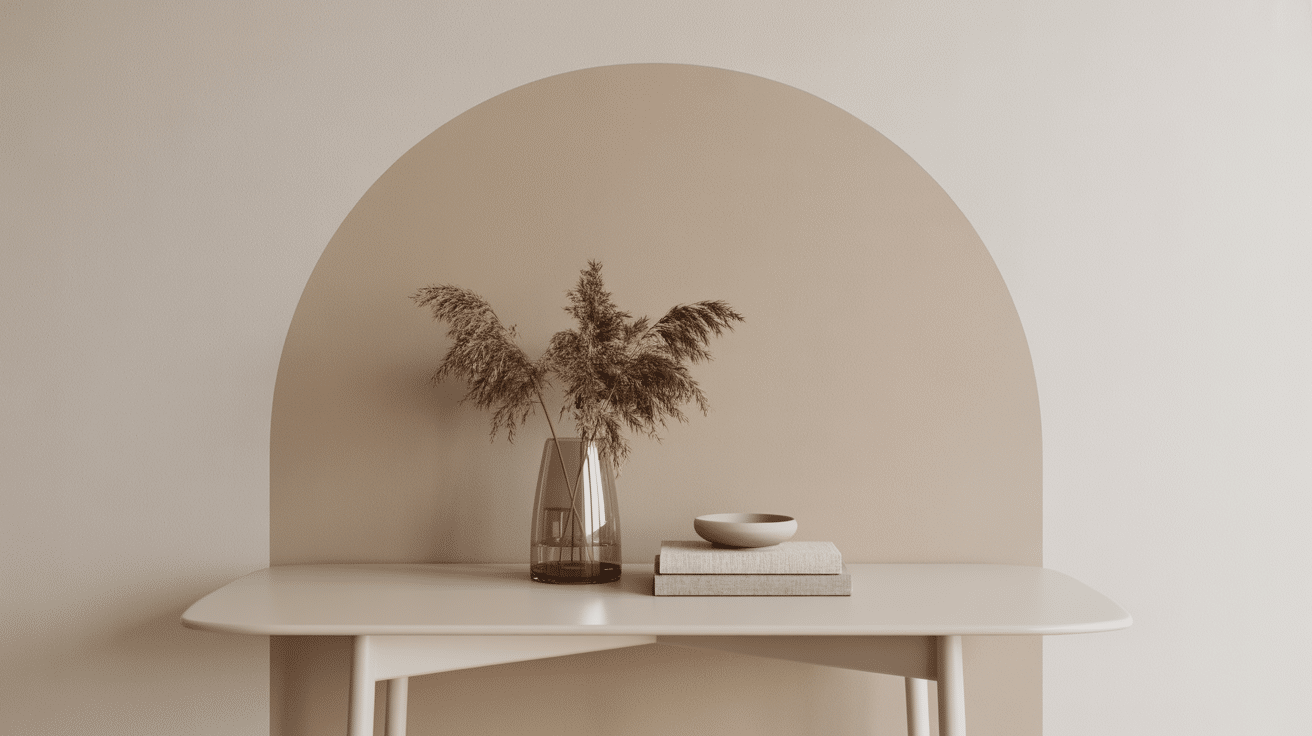
Ever notice how certain colors instantly make you feel at home? That’s exactly what happens with vanilla latte color – this warm beige shade does something special that most neutrals can’t. Unlike stark whites or cold grays, it wraps your space in gentle warmth. I’ve seen how this versatile hue changes both sleek modern homes and cozy traditional spaces. It creates that perfect backdrop where you actually want to linger, not just pass through. Let me show you why this comforting shade might just be the missing piece your home needs. Jotun Vanilla Latte on the Color Wheel When I look at vanilla latte on the color wheel, it sits perfectly between warm off-whites and light tan tones. It’s not quite cream, but definitely warmer than basic beige. Lighting changes everything with this shade. In natural daylight, I notice it shows cooler undertones. But under warm artificial light? It becomes incredibly cozy and inviting. Here’s what makes this color special in proven technical terms: Color Property Vanilla Latte Details LRV 70.89% (reflects most light) HEX Code #E5DAC8 RGB Values 229, 218, 200 Undertones Beige, creamy taupe, warm neutral This technical info helps, but what I really love is how forgiving this color is in different rooms and lighting conditions. Best Combinations with Vanilla Latte Creating beautiful color combinations with vanilla latte color is easier than you think. I’ve found this warm neutral works perfectly whether you want soft monochromatic schemes or bold complementary contrasts. Similar Color Options for Vanilla Latte Color I love working with monochromatic hues because they create such peaceful, cohesive spaces. With vanilla latte as my first choice, I have some similar shades to offer to people looking for slightly different undertones. Jotun Mild 1275 This soft off-white has an LRV of 74.4%, meaning it reflects tons of light and makes rooms feel bigger. I painted a client’s small hallway in Mild, and it completely opened up the space. It’s like Vanilla Latte’s lighter, airier cousin. Jotun Sense 1875 Another high-reflecting neutral with an LRV of 73.79% that’s perfect for ceilings. One client had dark wood beams, so I used Sense on the ceiling to balance the heaviness. It’s whisper-quiet but still has character. Jotun Milky Way 1832 The creamiest of the light tones with an LRV of 73.93% and just a hint of warmth. I love using this in nurseries or spaces where you want that soft, cloud-like feeling. Layering Subtle Monochromatic Neutrals These richer tones add urbanity and depth to any vanilla latte color scheme. I reach for them when clients want more drama or need to ground a space with stronger anchor points. Jotun Memento 1991 This rich taupe has an LRV of 39.2%, adding serious depth without being dark. I used it on one accent wall in a client’s dining room, and it made their art collection pop beautifully. Jotun Earthy Yellow 8583 Warm and grounding with an LRV of 50.6% and subtle yellow hints. Perfect for a cozy reading corner I designed last month. It feels like sunshine filtered through linen curtains. Jotun Observe 1303 A sophisticated mushroom tone with an LRV of 52.08% that works anywhere. I painted kitchen cabinets in this color for a client who wanted something unique but timeless. Jotun Wood Smoke 0568 The perfect medium neutral with an LRV of 60.75%, this color bridges light and dark tones. I use this constantly for built-ins and trim work. Creating Calm with Complementary Hues Jotun Gustavian Blue 4109 This muted blue-gray has an LRV of 38.48% and creates the most calming contrast with vanilla latte. I paired these in a client’s bedroom, and they said it felt like sleeping in a cloud. The combination is sophisticated but never cold. Jotun Classic Blue 4062 Lighter and softer than Gustavian, this blue has an LRV of 51.93% and feels like morning mist. One client wanted a coastal vibe without the cliché, so I used this with Vanilla Latte throughout their living room. Jotun Industrial Blue 5455 The darkest option with an LRV of 11.02% that adds serious drama. I used this on kitchen cabinets while keeping the walls in Vanilla Latte. The contrast was striking, but still felt homey. Jotun Alladin 4468 This pale blue-gray has an LRV of 59.12% and is like wearing your favorite soft sweater. Perfect for bathrooms or any space where you want tranquility with warmth. Jotun Heath Violet 4177 The lightest option with an LRV of 66.91% and subtle violet undertones. I painted a powder room in this color with Vanilla Latte trim, and guests always comment on how serene it feels. Vanilla Latte Color Palette Inspiration I’ve found that vanilla latte color adapts beautifully to different design styles. Here’s how I use it across various lifestyle palettes: Soft Romantic This is where vanilla latte truly shines. I pair it with dusty pinks and cream whites to create spaces that feel like a gentle hug. Accents: Blush pink throw pillows, antique brass hardware, cream ceramic vases, soft gray textiles Decor Items: Vintage mirrors with ornate frames, fresh white peonies, linen curtains with subtle texture, crystal table lamps with fabric shades Modern Boho Earth Here, I combine vanilla latte with terracotta and sage green. The result feels grounded yet free-spirited. Accents: Rust-colored macrame wall hangings, natural jute rugs, brass plant stands, woven baskets in caramel tonesDecor Items: Large leafy plants in ceramic planters, wooden coffee tables with live edges, textured throw blankets, pendant lights with natural fiber shades Classic Minimalist I love pairing vanilla latte with crisp whites and soft grays for this clean, uncluttered look. It adds warmth without chaos. Accents: White marble countertops, brushed steel fixtures, pale gray ceramics, linen bedding in natural tones Decor Items: Single statement art pieces, sleek table lamps, glass vases with simple lines, neutral throw pillows with geometric patterns Nordic Scandi Blend This is my go-to for clients who want cozy but clean. I mix vanilla latte with cool whites, pale woods, and touches of charcoal. Accents: Light oak furniture, white wool throws, black metal light fixtures, pale blue ceramic pieces Decor Items: Sheepskin rugs, simple wooden candlesticks, white ceramic planters, woven wall art in natural fibers Wrapping Up After working with countless color schemes, I keep coming back to vanilla latte color for one simple reason, it just works. This warm beige brings that perfect balance of sophistication and comfort that most neutrals miss. Whether you paint one accent wall or transform your entire home, this palette creates spaces where life actually happens. It’s forgiving with mistakes, works with any lighting, and grows with your style over time. Your home should welcome you. Vanilla latte color does exactly that.
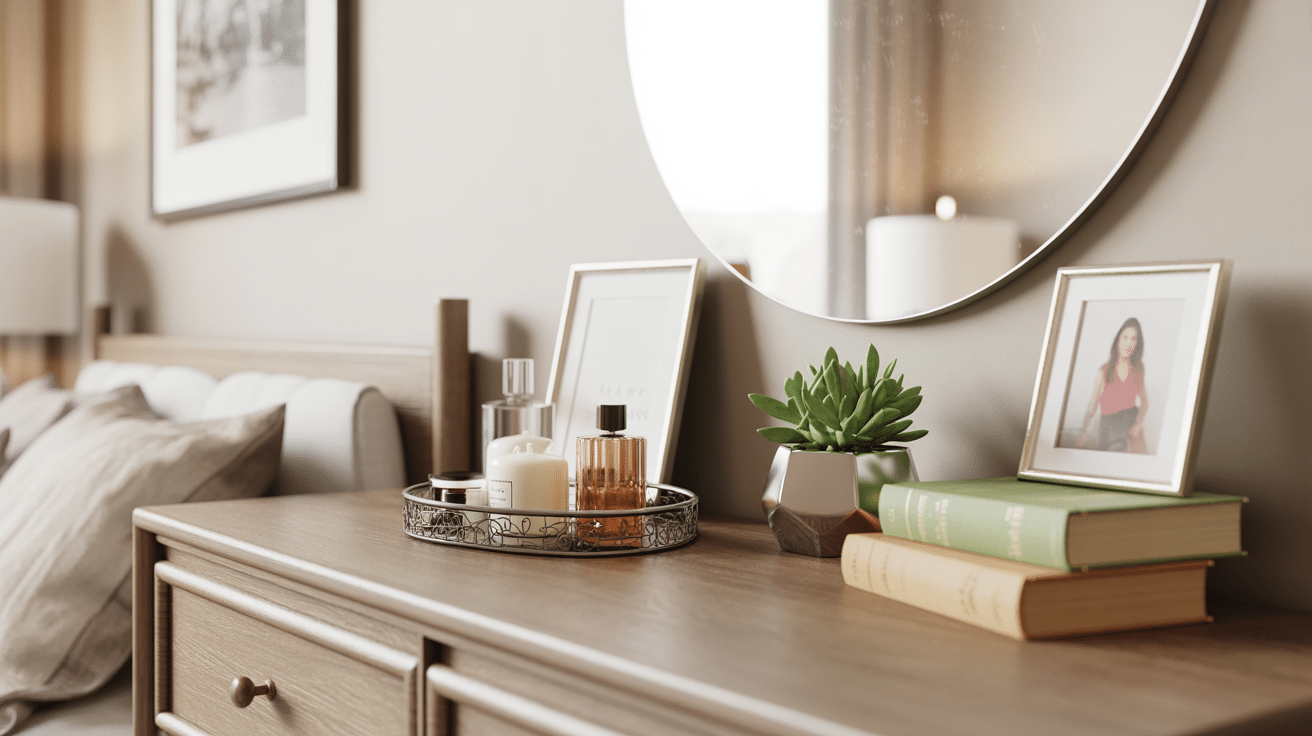
Your bedroom dresser sits there looking plain and boring. You walk past it every day, wishing it looked more put-together like those rooms you see on Pinterest. But every time you try to add a few items on top, it ends up looking cluttered or messy. You buy pretty things, place them carefully, yet something still feels off. It’s frustrating when you want your space to feel welcoming but can’t seem to get the styling right. This blog will tell you how to style a dresser. The secret isn’t buying more stuff, but it’s about using what you already have in the right way. What You Need Before You Start Styling Before you begin styling your dresser, gather a few basic items that most people already have at home. You’ll need a clean cloth to wipe down the surface. Look around your house for items like books, small plants, candles, or picture frames. Collect all the items you want to display, including decorative pieces, plants, books, or personal items. Don’t worry about buying new things right away. Often, the best styling comes from mixing items you already own. Clear off your dresser completely before you start. This gives you a fresh canvas to work with. Have a measuring tape handy to check heights and spacing. Grab a soft cloth for dusting as you work. Think about the overall look you want to achieve – modern, cozy, or minimalist. Having a clear vision and all your supplies ready will make the styling process much smoother and more enjoyable. How to Style a Dresser? Styling a dresser doesn’t have to be complicated. The key is to create balance while maintaining functionality. Here are proven methods for how to style a dresser. Each approach focuses on making your dresser both aesthetically pleasing and functional. 1. Clean Your Dresser Completely Wipe down your dresser surface completely before adding anything. Dust and fingerprints make even the prettiest items look messy. Use a microfiber cloth with a gentle cleaner. This step makes a huge difference in how polished your final look appears. A clean base helps colors pop and makes everything feel fresh. 2. Incorporate Storage Solutions Smart storage keeps your dresser both stylish and functional. Use decorative boxes to hide clutter while adding visual interest. Pretty baskets work great for storing items you use daily. Choose storage pieces that match your room’s style so they blend seamlessly with your decor. Use trays, bowls, or decorative boxes to corral smaller items such as jewelry, watches, or perfumes. Woven baskets or lidded containers can hold everyday essentials out of sight, keeping your dresser tidy and functional without sacrificing style. 3. Create Balance and Dimension Group items in sets of three for the most visually pleasing arrangement, as this classic design rule keeps things interesting without overwhelming the eye. Vary the heights within each group: combine a tall lamp or vase, a medium-sized picture frame or sculpture, and a shorter candle or dish. Layer in stacked books or decorative boxes to add depth and serve as platforms for smaller objects. Mixing textures, shapes, and materials within these groupings brings added richness and dimension to your dresser top. 4. Include Something Living A small plant or fresh flowers instantly make any space feel more alive. Succulents are a great choice if you want something low-maintenance, as they need little water and look good for months. Even a single stem in a small vase adds life to your dresser. Plants also help purify the air in your bedroom. Succulent Light Needs Best for Gasteria Low light Bookshelf or tabletop styling Jade Plant Low to indirect light Classic & minimal look Panda Plant Medium to low light Soft-textured accent styling These succulents are hardy, stylish, and ideal for dresser decor in rooms that don’t receive much direct sunlight. 5. Display Personal Photos Add one or two framed photos that make you happy. Family pictures, travel memories, or pet photos work perfectly. Don’t overcrowd with too many frames, as less is more. Choose frames that match your room’s style. Personal touches make your space feel uniquely yours rather than like a store display. 6. Leave Some Empty Space Don’t fill every inch of your dresser top. Empty space lets your styled items breathe and look more intentional. Too many things create visual chaos and make cleaning harder. Aim to style about two-thirds of the surface, leaving one-third clear. This approach feels calm and organized rather than cluttered and busy. Dresser Styling Themes to Match Your Vibe As you now know how to style a dresser, you can try out different themes to help you create a cohesive look that matches your personality. Each style uses specific colors, textures, and items to achieve its unique feel. Cottagecore Style Bring cozy countryside vibes to your dresser with soft, natural elements that feel warm and lived-in. Mason jars with wildflowers or dried lavender. Vintage books with worn covers. Small ceramic animals or wooden figurines. Lace doilies under decorative items. Dark Academia Look Create an intellectual, moody atmosphere with rich colors and scholarly items that feel timeless and classy. A stack of classic novels with dark covers Vintage brass candlesticks with dark candles Old maps or antique globes Dark wood Leather accents Minimalist Modern Keep things clean and simple with neutral colors and functional items that serve multiple purposes. Single statement piece, like a sleek vase or a quality candle in a glass holder White or black picture frames Small succulent in a geometric planter Boho Chic Mix textures and earthy tones for a relaxed, worldly feel that celebrates handmade and natural items. Macrame plant hangers with trailing plants Wooden beads or carved figurines Woven baskets for storage Colorful scarves as table runners Scandinavian Style Focus on light colors and natural materials that create a calm, uncluttered space with cozy touches. Light wood accessories and trays White ceramic vases with single stems Soft gray or cream textiles Final Thoughts Styling your dresser is simpler than most people think. You don’t need expensive items or perfect design skills. The techniques we covered -the rule of three, adding height, including living elements, and leaving breathing room. Your dresser should reflect who you are, not what you think it should look like. Start with one or two items you love, then build from there. Ready to give your dresser a fresh look? Pick one styling tip from this guide and try it today. Small changes make a big difference. Your bedroom will feel more personal and put-together in no time.